Design
Design pages cover how Orion looks and feels: its visual direction, how the canvas responds to input, and studies of ideas before they're built.
A study explores an idea and recommends what to keep. It isn't a promise that the idea ships. Once a direction is chosen, the call moves into the decisions, and the Guide describes what shipped.
Threads
- Canvas and layout: layout explorations, window chrome, system diagrams, and card details.
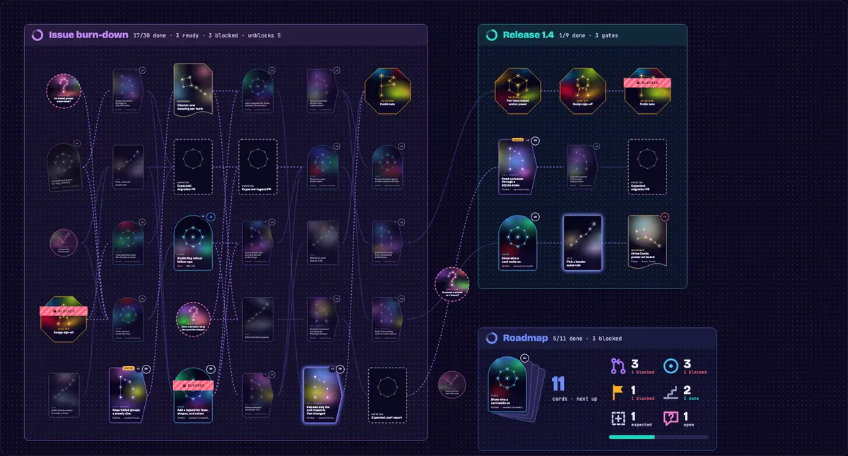
- Card identity: telling a card's kind, source, and state apart at 0.33 zoom, in two rounds of galleries.
- Card skins: each way a card can be drawn, embedded live from Storybook.
- Companion: the star guide that perches on the card nearest the pointer.
- Gummy Galaxy and Orion: the Luau-centered vision around Orion and the hands-on canvas ideas it inspires.
- Gummy Galaxy concept art: Gummy Galaxy drawn as a game, with its worlds, their emblems, the companion, and the sources to render them again.
- Logo: the icon's studies, its palettes, and the sources for drawing it again.
- Motion and feel: what moves and what stays still, and the effects for finished work.
- Themes and skins: the vibrant theme, swappable themes, and card skins.
- Trading cards: the card skin, its rarity and kinds, and its compact form at far zoom.
Live components
Components on these pages are the app's own, embedded from its Storybook. The Storybook workflow publishes it to Chromatic whenever a change to the app lands on main, so the pages always show what main draws. To embed a story, use its id from the Storybook URL:
<Story id="canvas-cards-and-edges-tradingcard--playground" title="A pull request in review" :height="440" />Locally, npm run dev in docs/ embeds from npm run storybook in workspace/orion-app/ instead, so stories you're editing show up as you change them.
Timeline
Each entry is dated by when its pull request was opened.
October 5, 2026
- Animate less, and only where motion can be seen: idle loops stop off screen and below 0.6 zoom.
- Explore horizontal skyscraper gravity layout: a skyline layout for top-level groups, explored.
October 6, 2026
- Explore Orion, Star Charter, and Artemis icons: three names, two directions each, judged at Dock size.
- Spike trading card nodes and hands: every card drawn as a trading card, explored.
- Show blockers in front of waiting work instead of Blocked labels: blockers as gateways, explored.
October 7, 2026
- Replace the app icon and keep the logo sources: three stars over the card art's grain gradient.
- Study a vibrant theme with dithered trading-card nodes and a star companion: the study behind the Vibrant theme, the trading cards, and the companion.
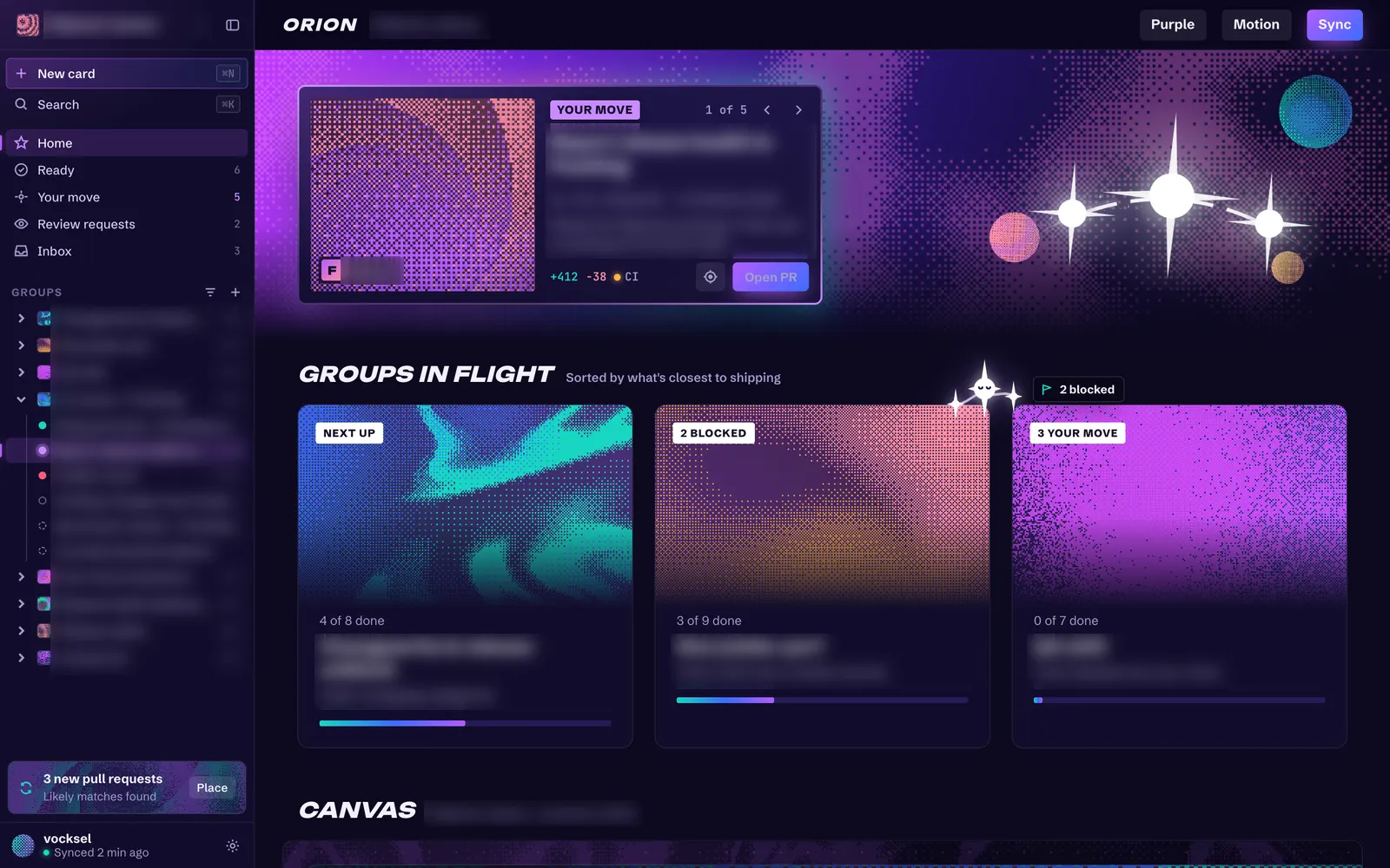
Card text from other projects is blurred in the vibrant study images.
October 8, 2026
- Explore Orion, Star Charter, and Artemis icons: the icon study carried onto current main.
October 9, 2026
- Make themes swappable and add a vibrant purple theme: one CSS file per theme, and Vibrant shipped.
- Add a card skin registry with Classic and Plain skins: skins draw cards apart from the theme.
- Add a trading card skin: the study's cards in the app.
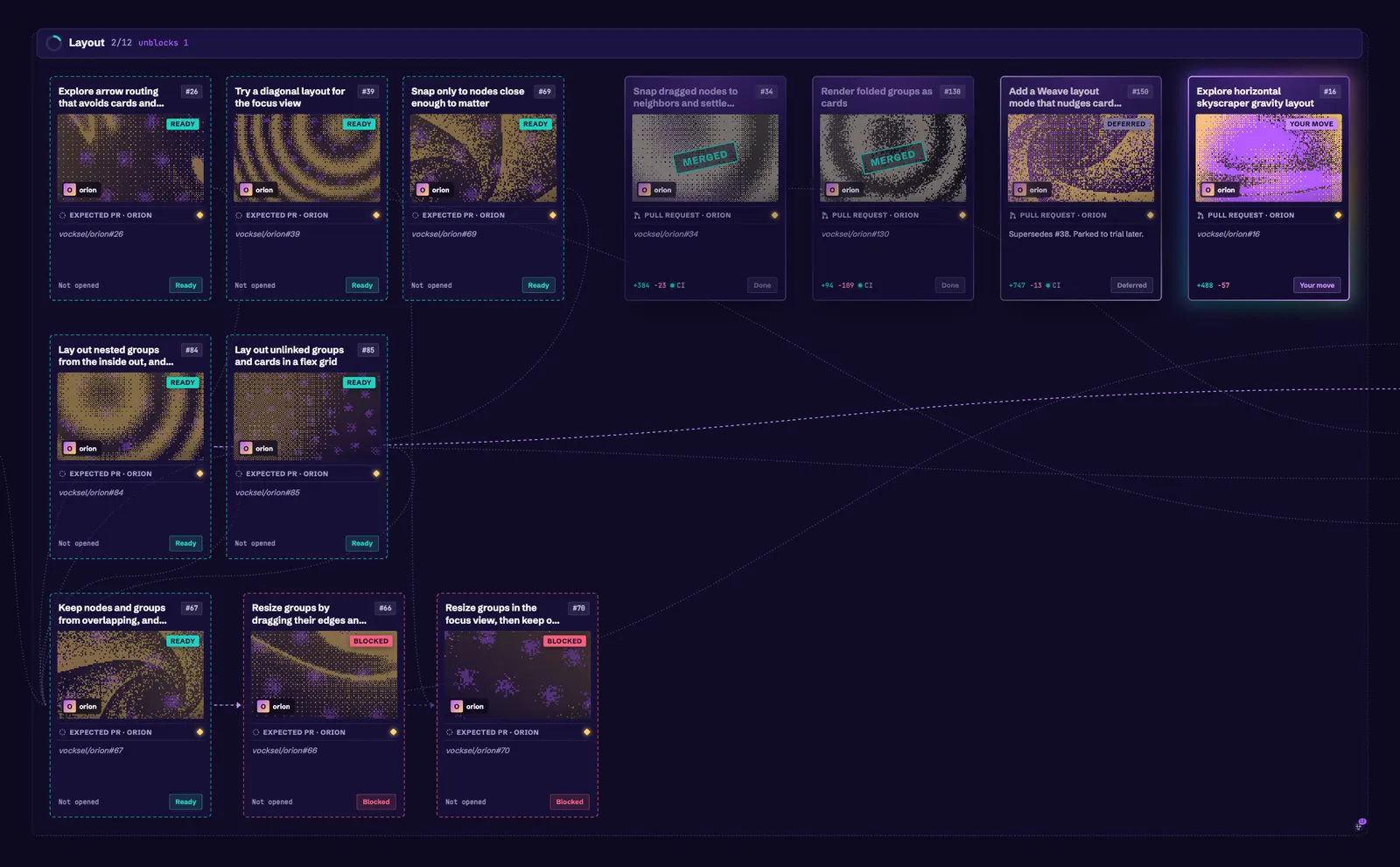
- Give cards a rarity from the work that feeds into them: rarity from upstream work, shown as a set symbol.
- Add a Conventional theme and card skin: set aside.
- Add a Board card skin: set aside.
- Give each card kind its own silhouette, symbol, and tint: closed as a separate pass.
- Draw trading card art as geometric posters built from each card: set aside.
- Study card variety: kind identity, geometric art, rarity, and layouts: explored.
- Add a Weave layout mode that nudges cards off the lines crossing them: cards move off the lines through them, explored.
October 10, 2026
- Update the app icon to the new star logo: four-point stars on the tide background.
- Draw Orion's own window chrome: the desktop app draws its own title bar.
- Draw system diagrams with components and labeled links: components, shapes, and labeled links for drawing systems.
October 11, 2026
- Name design tokens for colors, status, type, radii, and spacing: themes set named values.
- Load shareable theme files from the data folder: a theme can travel as a file.
- Give canvases and groups a cover and background: image covers and dimmed backgrounds.
- Show a finish stamp on finished cards that clears through the chain: the chain clears one hop at a time.
- Redesign the trading card so each part has one job: one job for each part of the card.
- Record that foil marks rarity and priority lifts it: foil follows rarity.
October 12, 2026
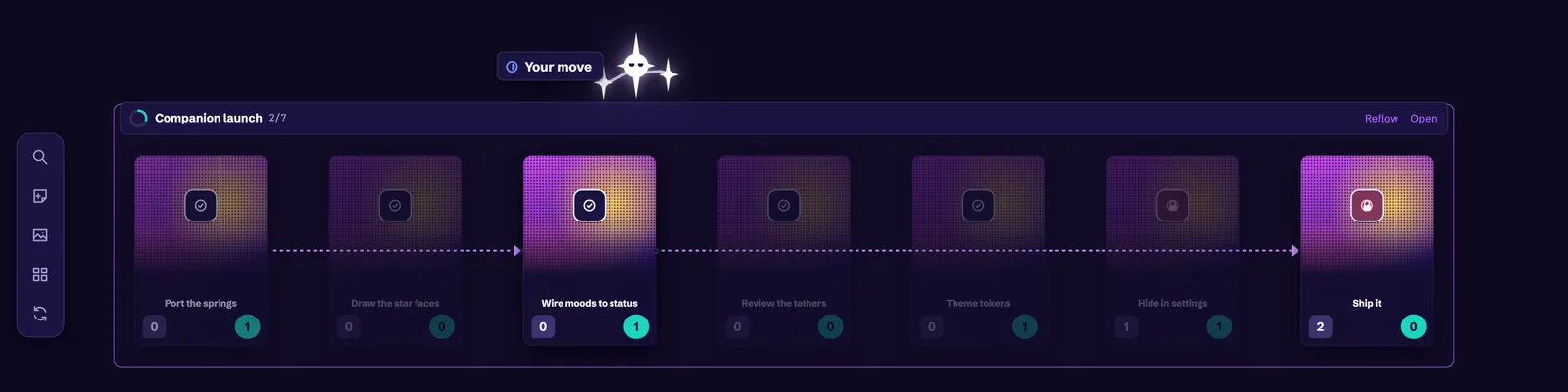
- Bring the star companion into the app: the companion perches on the nearest card and reacts to its status.
October 13, 2026
- Stamp finished cards Done once they're closed out: a Done stamp on closed-out cards.

- Draw compact cards and drop related links at far zoom: far-zoom cards keep the essentials.
- Draw only the cards near the view, nearest first: cards far from the view don't draw their bodies.
- Preview what a folded group holds: faded previews inside folded groups.
- Give canvases and groups a Markdown header: a header band for canvases and groups.
- Give card details a roomier panel with Markdown notes and collapsible links: a wider details panel.
October 15, 2026
- Add a charter section on designing for the senses: feel, sound, and focus as goals for Orion.
October 17, 2026
- Keep faded trading cards opaque: links no longer show through a faded card.
- Draw every compact trading card as the poster card: merged October 17.
- Cut the companion's and done shimmer's per-frame paint work: in review.
October 18, 2026
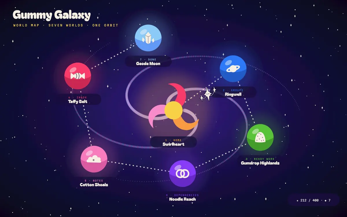
- Add Gummy Galaxy concept art to the design docs: seven draft worlds, their emblems, and the studies behind them.
October 23, 2026
- Add the card identity study to the design docs: two rounds of card galleries for telling kind, source, and state apart at 0.33.